To create a perfect website you must need to understand one of the most fundamental web design principal – CSS Box Model.
The box model in CSS is a fundamental concept that describes the design and layout of elements on a web page. CSS Box model describes how items are displayed within your website. It defines their boundaries, and spacing both in and outside the target element.
In this model, a rectangular box is generated for HTML elements. Each is laid out according to its dimension (height- width), type of element such as inline, block or inline-block etc., positioning, relationship to other elements, and external factors like viewport size. This box consists of content, padding, a border, and margin. So CSS box model determined how your web page rendered on the internet.
Good knowledge of CSS Box Model helps to create complex layout of webpage and align items for your website.
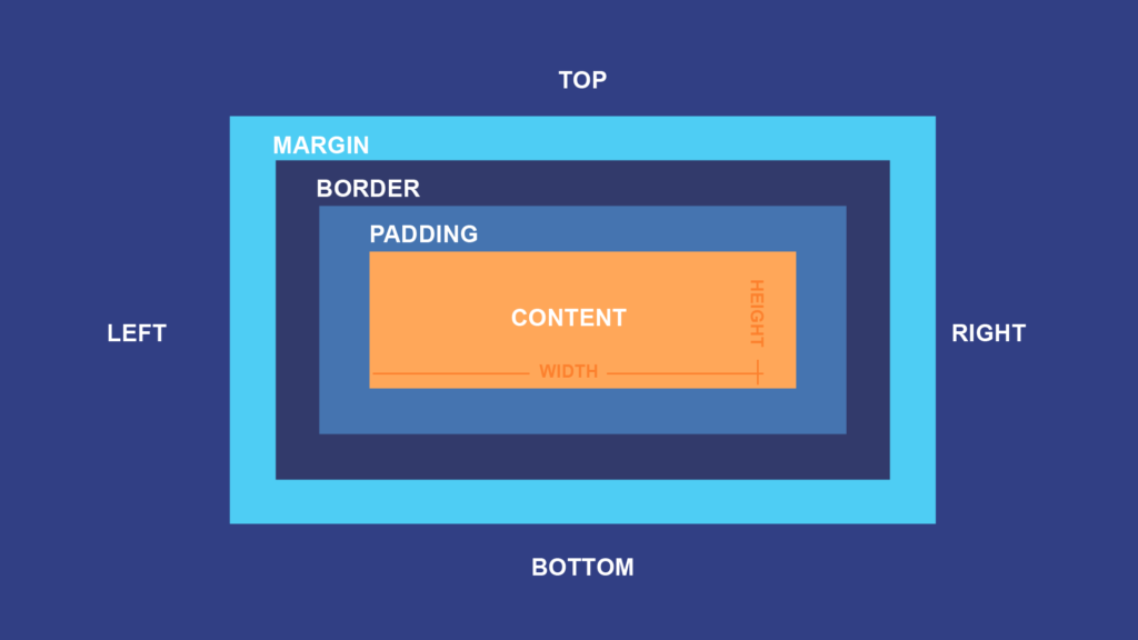
The CSS box model is essentially a box that wraps around every HTML element. It consists of: margins, borders, padding, and the actual content. The image below illustrates the box model:
It consists of four main components that define the space an element occupies: content, padding, border, and margin.
Content: This refers to the actual content, such as text, images, or other media, contained within the element. The size of the content area is determined by the width and height properties.
Padding: Padding is the space between the content and the border. It adds internal space within the element, creating distance between the content and the border. Padding can be specified using properties like padding–top, padding–right, padding–bottom, and padding–left.
Border: The border surrounds the padding and content of an element. It’s the line that separates the padding from the margin and can be styled with properties like border–width, border–style, and border–color.
Margin: Margins are the spaces outside the border of an element. They provide separation between the element and other elements on the page. Margins can be set using properties like margin-top, margin-right, margin-bottom, and margin-left.
In CSS box modal, the height and width property determines the size of content area if padding, border and margin properties are also used they will be added to the height and width to calculate total size of the element.
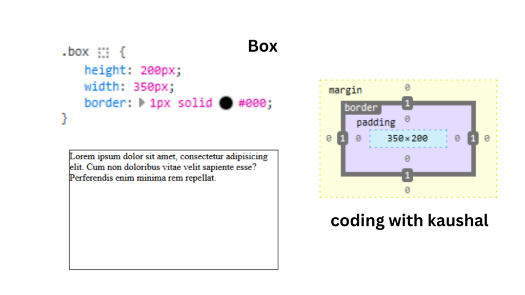
Lets understand with example.
<!DOCTYPE html>
<html lang="en">
<head>
<title>Box Modal</title>
<style>
.box{
height: 200px;
width:350px;
border:1px solid #000;
}
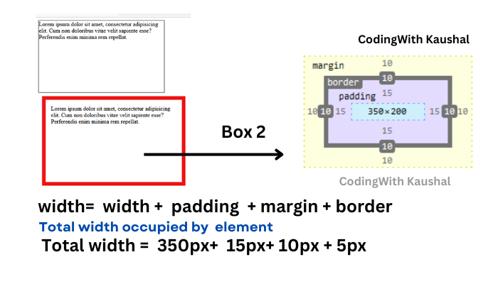
.box2{
height: 200px;
width:350px;
border:10px solid #ee1111;
padding:15px;
margin:10px;
}
</style>
</head>
<body>
<div class="box">
Lorem ipsum dolor sit amet, consectetur adipisicing elit.
Cum non doloribus vitae velit sapiente esse? Perferendis
enim minima rem repellat.
</div>
<div class="box2">
Lorem ipsum dolor sit amet, consectetur adipisicing elit.
Cum non doloribus vitae velit sapiente esse? Perferendis
enim minima rem repellat.
</div>
</body>
</html>
In above example you can see there are two div element with box and box2 class. Both have same dimension – height and width but box2 has padding, margin and border, so box2 Total height will be consider as height +padding +border +margin and same for the width means width+ padding + border + margin.
So when you set a width and height for an element, the overall space the element occupies will include the content size plus any padding, borders, and margins.
I hope you like the content, if yes please share your review and follow us.