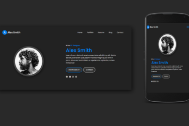
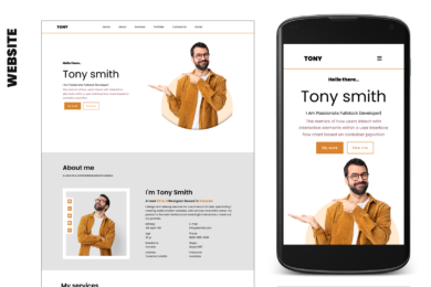
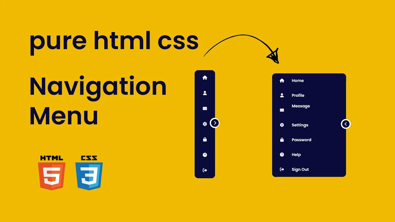
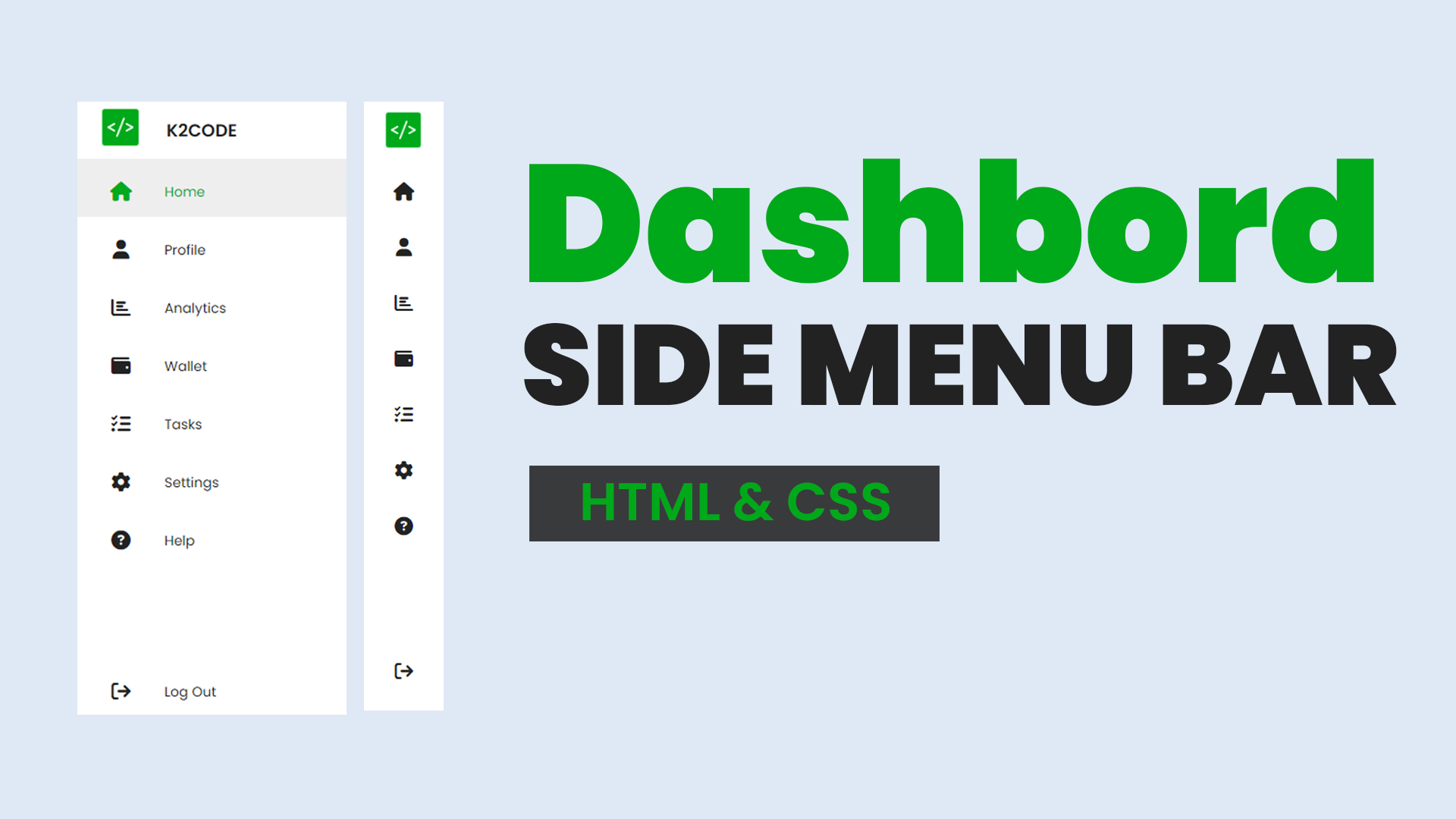
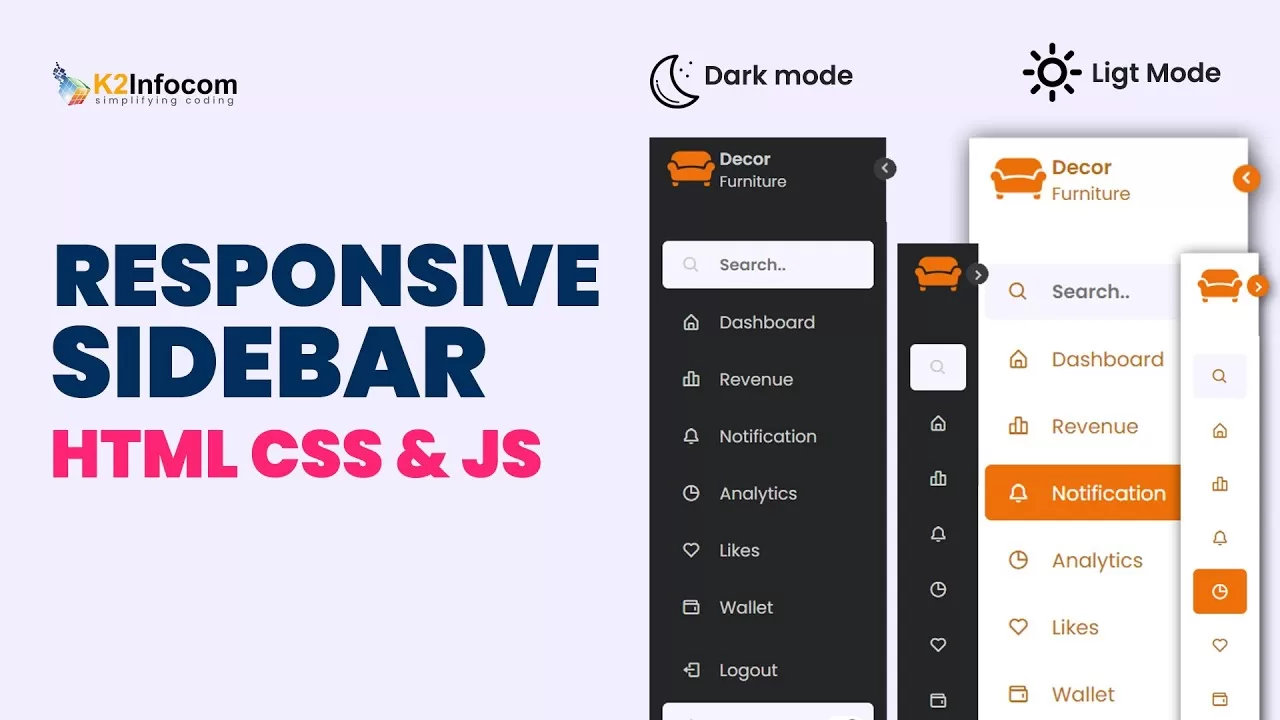

What is Navigation Bar and Need of Navigation bar?
The main purpose of a Responsive Navigation Bar is to make it easy for users to move around and access different parts of Website or Program. Navigation Bar appears at the top of a web page or screen. Navigation bar provides users with a set of links or buttons that allow them to navigate different sections or pages.
Watch Video Tutorial
In this tutorial blog we are going to create responsive navbar in HTML CSS and JavaScript from Scratch. The navbar is responsive to any device, it adjust height and width on different devices. I used CSS Flex propertyย and media query for responsive design. Stay with us follow the step with code and createย an amazing responsive navbar.ย
Lets start with HTML [Source Code]
First we need to create basic starting template with required links for external CSS file,ย font awesome CSS icons CDN links inย head section of html file.
Navigation Bar
In our navbar there are three main sectionย
1. Logo
2. Menu ( created with <ul></ul> )
3. Search boxย
So followingย code create basic structure of our navbar
Output Screenshot :

Now lets start our CSS code
*{
margin: 0;
padding: 0;
box-sizing: border-box;
font-family: 'poppins';
text-decoration: none;
list-style: none;
}
.container{
min-height: 100vh;
width: 100%;
background: url("images/14.jpg");
background-size: cover;
overflow-x: hidden;
}
nav{
min-height: 100px;
width: 100%;
display: flex;
justify-content: space-around;
align-items: center;
z-index: 999;
background: rgba(255, 255, 255, 0.15);
box-shadow: 3px 3px 7px rgba(0, 0, 0, 0.2);
}
.logo a{
font-size: 1.5rem;
color: #fff;
font-weight: 600;
}
ul li{
display: inline-block;
margin: 0 8px;
}
ul li a{
color: #fff;
transition: .6s;
}
ul li:hover a{
color: rgb(255, 155, 0);
}
.search{
display: flex;
position: fixed;
right: 15%;
}
.search input{
border-radius: 30px;
padding: 5px 8px;
box-shadow: 0 3px 7px rgba(0, 0, 0, 0.2);
width: 0px;
transition: .6s;
}
.search i{
position: absolute;
top: -3px;
right: -3px;
padding: 10px;
background-color: rgb(255, 155, 0);
border-radius: 50%;
color: #fff;
text-align: center;
font-size: 1.2rem;
box-shadow: -2px 0 5px rgba(0, 0, 0, 0.25);
}
.bar i{
font-size: 1.3rem;
color: #fff;
display: none;
}
.search .show{
width: 150px;
}
Media Query Code for Responsive Design
@media(max-width:800px){
.bar i{
display: block;
}
nav{
position: relative;
}
nav ul{
position: absolute;
top: 100%;
right: -100%;
height: 80vh;
width: 80%;
background: rgba(255, 255, 255, 0.2);
text-align: center;
transition: .6s;
border-top-left-radius: 8px;
border-bottom-left-radius: 8px;
backdrop-filter: blur(15px);
}
nav ul li{
display: block;
margin-top: 10px;
margin: 20px 0;
padding: 8px;
}
nav .open{
right: 0;
}
.search{
right: 30%;
position: fixed;
}
}
@media(max-width:450px){
.search{
display: none;
}
}
Below Tutorial for beginnersย How To Create Responsive Navbar in HTML CSS and Javascript.ย
click on video to view and Don’t Forget to subscribe Our Channelย
Navigation Bar
Recent Post
The New AI sensation Deepseek
- February 7, 2025
- 5 min read
Var keyword in C#
- May 8, 2024
- 4 min read
What is Cloud Computing ? Definition &
- April 2, 2024
- 4 min read