Media queries are a fundamental part of responsive web design in CSS. Media queries enable you to create breakpoints where specific styles are applied based on screen width and height.
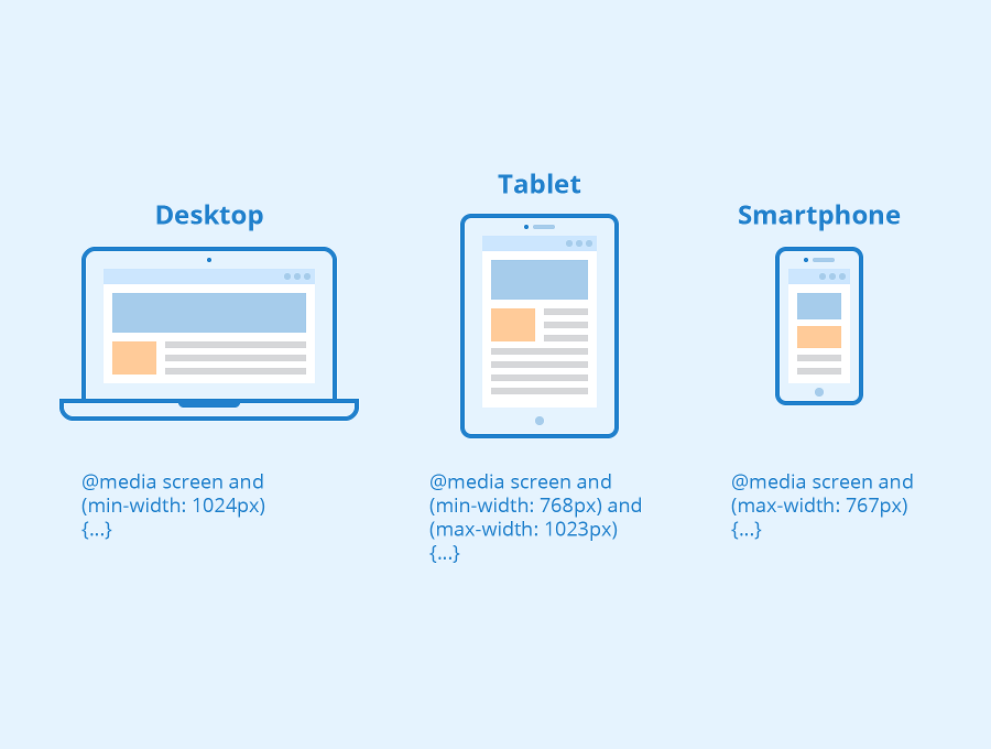
“Responsive” refers to a web design approach that aims to make web pages look good on a wide range of devices and screen sizes.
The primary goal of responsive web design is to create a smooth and user-friendly experience whether the user is accessing a website on a desktop computer, tablet, smartphone, or any other device with varying screen dimensions.
Here’s the basic syntax of a media query in CSS:
					@media media_type and (media_feature) {
  /* CSS rules to apply when the media query matches */
}
To ensure correct display on each device, a viewport meta tag has to be integrated into the head area of HTML code. This meta tag tells browsers how to handle the dimensions and scaling of the page. The syntax is:
With “width=device-width” browsers are instructed to use the width of the screen in device-independent pixels. The directive “initial-scale=1.0” guarantees a 1:1 relation between CSS pixels and device-independent pixels.
@media: This is the keyword that indicates the start of a media query.
media_type: Specifies the type of media or device the query is targeting. Common values include screen (for computer screens), print (for printers), all (applies to all media types), and more.
media_feature: Describes the condition or characteristics that the media query should check. Common media features include width, height, min-width, max-width, orientation, color, and resolution, among others.
Media features are used to target specific characteristics of the device or viewport. Some common media features include:
width: Specifies the width of the viewport.
height: Specifies the height of the viewport.
min-width and max-width: Defines a range of viewport widths.
orientation: Checks if the device is in portrait or landscape mode.
aspect-ratio: Specifies the aspect ratio of the viewport.
color: Checks the number of bits per color component.
resolution: Checks the resolution of the output device.
Logical Operators With Media Query
We can combine multiple media features using logical operators like and, not, and only. For example:
@media screen and (max-width: 768px): Applies styles if the viewport width is 768 pixels or less.
@media screen and (min-width: 769px) and (max-width: 1024px): Applies styles if the viewport width is between 769px and 1024px.
@media screen and (orientation: landscape): Applies styles if the device is in landscape mode.
By using media queries, you can create responsive websites that adjust and look great whether viewed on a large desktop monitor or a small smartphone screen.
Media queries are essential for creating responsive web designs that adapt to various devices and screen sizes, providing a better user experience. They help ensure that your website looks and functions well on everything from desktop monitors to mobile phones.
